
Happy 2024 guys!
Welcome to a New Year of possibilities, personal goals and home goals. I think Every New year, I start off with a few reflections of the year prior, and decide what I want to take on in the new year. It usually boils down to 3 areas that I have new ambitions for.
1. My personal life. I’m always reflective about how I can make adjustments for being a better Mom, wife, friend, and friend to myself. Ive learned that each year I want to make sure I’m not dropping the ball and taking my loved ones or my life for granted, or letting my personal relationships grow stale without checking in on those I care about.
2. Would be my health ambitions, am I getting in exercise,5-6 days a week? Am I sleeping enough? (Ive always been one that does best with 8.5 hours of sleep per night, ive found I need a little more sleep than most of my peers) Am I taking mental breaks, quiet time, or meditation time to keep my anxiety from growing to unhealthy levels? Am I planning out meals so were doing our best to eat well and still have treats while avoiding eating out too much?
3. And lastly I always have my home goals for the year. Last year we made a lot of strides with the completion of furnishing the rest of our home, and adding in our downstairs lighting fixtures.
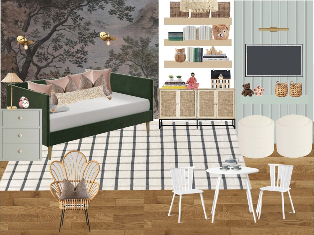
This year, I really want to focus on the finishes and color additions for our home. This includes adding tile to our primary bath, a tile backsplash to our kitchen and completing the playroom design.
The playroom is one of the spaces in the house that we started the design on, and never quite completed. As the kids have grown over the last three years that we’ve been in this house, my husband and I have noticed that this room has really gotten a lot of traffic and playtime. As a matter of fact our girls use this room and are in it more than their actual bedroom. The girls are 4 and 7 so they are at prime play ages. We noticed that the room was doing some heavy lifting but we didn’t quite have it optimized for easy clean up and storage.
So in comes my brain with all of the design possibilities. This space still flexes as a playroom/ guest room and since the kids are no longer in the toddler and baby phase, I wanted to add in a few more rich colors to strike that balance of chic and playfull.
Buuuuut… first things first. In keeping with a good new years tradition, my husband and I took time to clear out some toys for donation and maybe throw a few things out too. We found that the closet door is too heavy for the kids and was keeping them from getting in and out, which also adds to the place not getting too clean. We removed the doors and came up with a plan to put in an organizer that will hopefully house all toys when not in use. Thats the dream anyway.
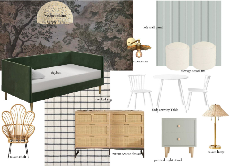
Once we were in a place that we felt was a clean slate, I worked out a plan of what we had and what we would be bringing in.
Heres the items that we already have.
Then for the items that we’ll be bringing in or replacing.
Just like with any goal, if you really want to execute, you need a plan. Home goals are no exception. I started with this design mock up then my husband and I started breaking things down into doable tasks. So far we have the old space cleaned up and the rattan cabinet purchased and assembled. Heres what she looks like IRL.
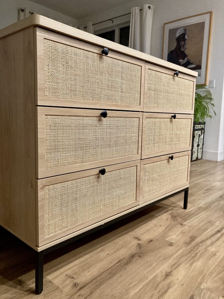
I’m still deciding whether we put the wallpaper up next, or start on the paneling, but whatever I decide, I’ll keep you in the loop on the exciting transformation…
to be continued.
Happy 2024 and happy home goals everyone!
Love,
Grace D.
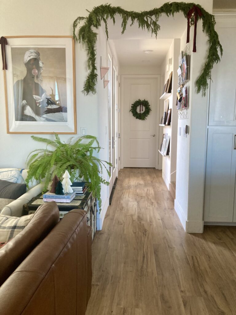
Happy December everyone! The Holiday season is in full swing and i’m very much into the Christmas Spirit.
This year for Christmas, I had a very similar goal to my Thanksgiving, I want to slow down and savor the season. After thinking on what that means, I came to the conclusion that meant simplifying, all the way around. 1 dont over schedule, 2 don’t over complicate, and 3 simplify decor to my true style. Well step one has come in the form of already having to say no to some extra parties this month in favor of a baking night in with some friends. Step 2, don’t overcomplicate. This came in the form of saying no to house hopping on Christmas and asigning my parents Christmas Eve and My Mother in Law Christmas day. Can you believe we used to actually do 3 houses on Christmas day? Ugghhh, i used to dread it, and finally, we’ve drawn the line and get to enjoy the day with only one destination.
Now step three, this one took a lot of mental effort. Pear down and simplify the decorating to my true style. Its true that I am inspired by the people that deck their homes out top to bottom for Christmas, but after much thought and sorting through my favorite pieces, I have come to the conclusion that , that is just not my style. I am in favor of simple Christmas additions, a lot of natural decor modern, midcentury and vintage touches. So I started with sorting through some of the decor from Christmas pasts where we had a lot of red and green and plastic ornaments. These were from the years that were first married and we couldn’t afford a lot. I loved those things for that phase in our life, but my style has changed over time and we now have the budget for pieces that are more true to my style.
So, that being said, I cleared out 2 whole christmas boxes of decor and consolidated the rest down to about three boxes. Since I really love natural garland and wreaths, i usually get those from our local trader joes along with some fresh christmas berries. I really love these organic additons to the home. I focused on all of the little details and am loving these bottle brush trees and paper trees this year. They offer that true mid century vintage nod and it really fits the style of our home, and in turn really fits my style.
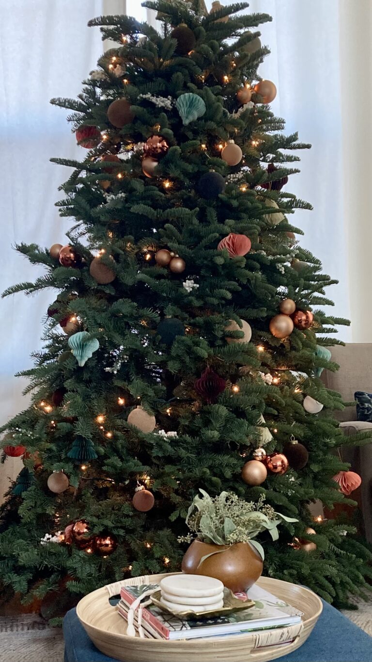
Our tree this year is also a mix of modern and vintage pieces. I opted for vintage glass ornaments in copper, these amazing Flocked West Elm Ornaments and these super cute paper accordion ornaments. So many of my favorite things. A little modern, a little vintage, and a little eclectic.
Flocked Ornaments are sold out. They were sold out early on and I just kept checking back until they were in stock. You can find similar ones here-Flocked ornaments
You can find vintage glass ornaments like these here- glass ornaments
The accordion paper ornaments are so cute and colorful and add great texture to the tree, you can find them here- accordion ornaments
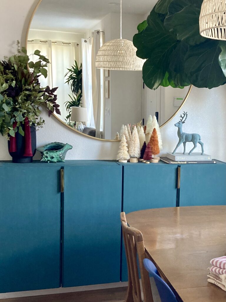
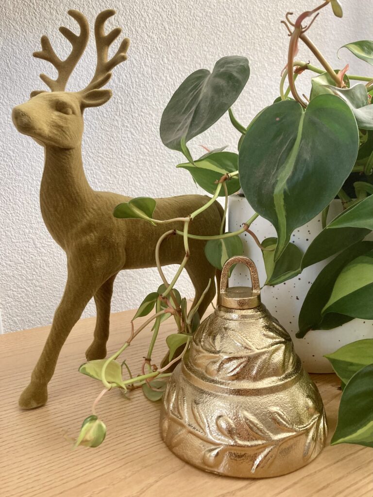
This is the first time that I truly feel that Christmas feels like me in my home. I think its a combination of clearing out things that we had, learning my real style over time and simplifying everything. Funny enough in the past I think for some reason I felt obligated to use every ornament and piece of decor that we had whether I really liked it or not. Like I didnt want anything to go to waste. Pearing everything down and simplifying has been so refreshing. I am loving the classic thoughtful details as opposed to a lot of everything.
Also for the first time, I’ve let go of a red and green theme in favor of more jewel tones and golds. I am loving the color palette and it really reflects the Jewel tones in our home. So its become an accent to what we already have instead of a complete overhaul.
Now with all of that being said, I still have plenty of whimsical Christmas elements since I have children and I want the Holidays to feel fun and joyous for them. We also have all of the family ornaments and fun kid ornaments on two small trees that the kids get to decorate. One is in the playroom and the other is right outside of the girls room. So we get a little bit of the fun nostalgic Christmas as well. As Emily Henderson said on her blog. I think It will be a long time before I see myself having the all neutral or very classy Christmas because I want Christmas to be fun and carry so many fun memories for my children.
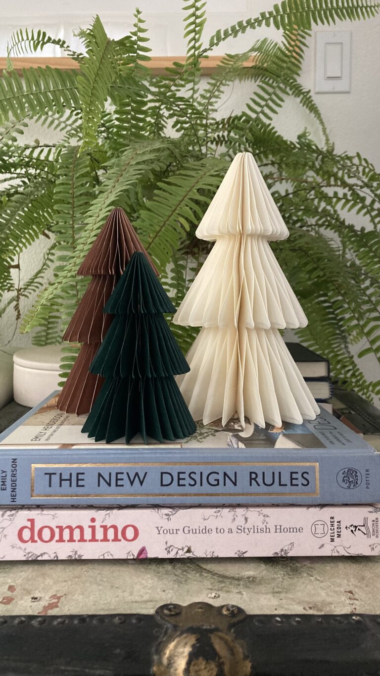
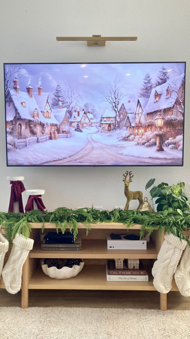
Overall simplifying my Christmas design Style has been very rewarding and refreshing. It is just step one in slowing down and enjoying the season. I think by slowing down and simplifying my Christmas season and schedule I will be able to be more present and really enjoy December as well. Funny enough over the weekend I had to miss a wedding because I was sick and I ended up having to stay home. The day consisted of baking with my kids and watching Christmas movies. Even though I missed being at the wedding I really felt like if this is what savoring the season and slowing down is like, its not bad at all. Outside of being a little under the weather its been one of my favorite Christmas memories this year, just watching rudolph and Baking! Love Love.
My hope is for each and every one of us to be able to find peace and Joy in this world we live in with so many heart wrenching things happening. I hope for us all that we can slow down, simplify, savor each little moment and enjoy the season.
Sending Love,
Grace
Happy November Everyone,
We’ll Halloween came and went in what seemed like the blink of an eye, and before the trick or treaters even hit the front door, it feels like half of the peeps on Instagram already had up Christmas Decor and Christmas content. I always feel like i’m behind schedule, yet I’ve always felt like i’m so behind in life in general. I wanted to meet my person earlier to be married earlier, I wanted to have a house earlier, I wanted to find my career earlier. Just always feeling like I’m not where I want to be. But those details are for another conversation. Haha!
All that being said, this year especially, I’m really trying to slow down and take it all in. Sometimes being a creator in a creative space makes that a little hard because everyone wants ideas and decor inspo before the actual season, so I feel like I always have to be ahead. I’ve found recently that a mental shift for me has made a difference. Like the totally obvious thing of ; one is what you do for work, so the work timeline, and another is real life timeline. So on my design page expect to see the Christmas inspo and gift guides and all things that I find may make it a little eaiser to design and shop for the season, but on my feed in snippets of my home, you will still see me taking in all things fall and really trying to savor the Season leading up to Thanksgiving.
Thnakgiving has always been my favorite Holiday and partly because I feel like Thanksgiving day is the kickoff to Christmas season, (so is Christmas really my favorite??? Hmmm) but another reason is because its always been such a chill holiday in my house . It was always about decorating with pumpkins and decorative serving trays, and even if it was just our immediate family, Just enjoying good food and watching movies all day was a wonderful thing. Those memories of past are what really make me work to savor this season Holiday by Holiday.
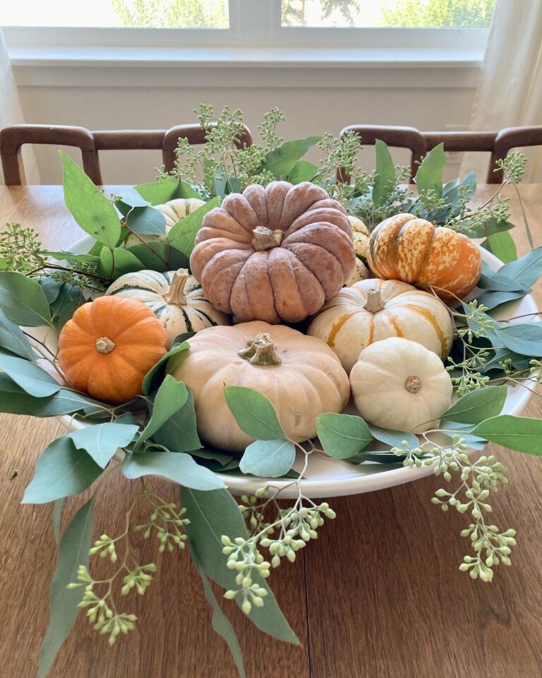
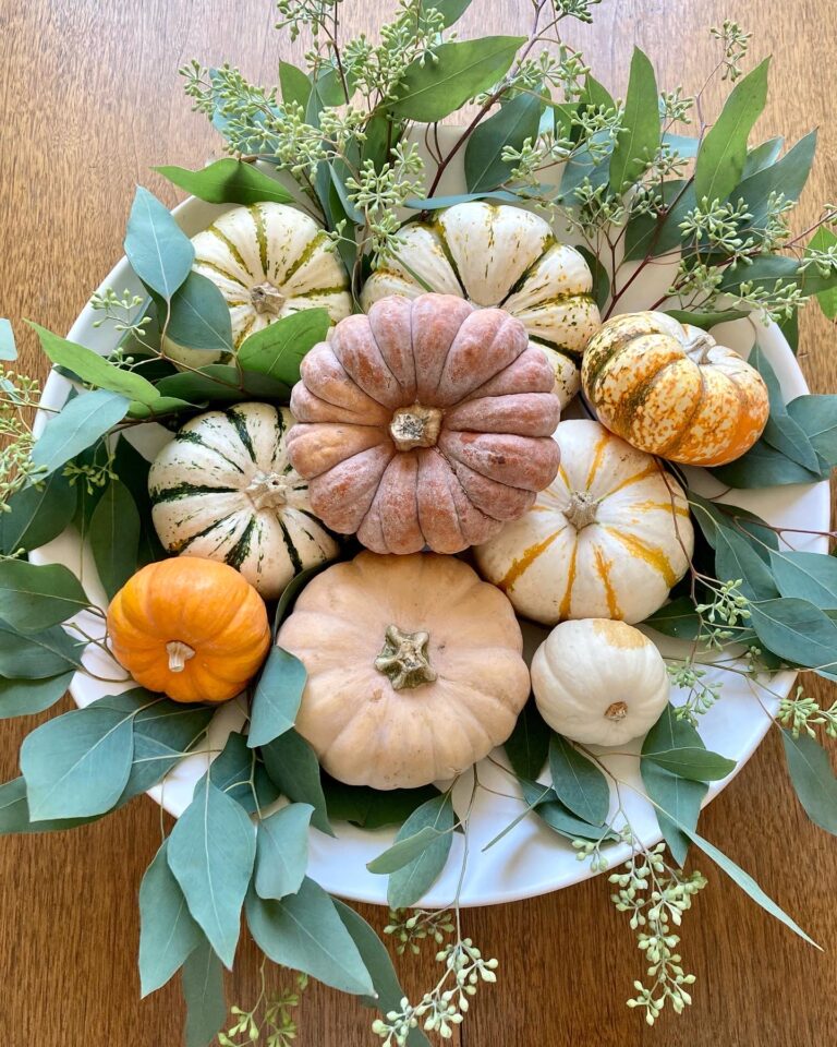
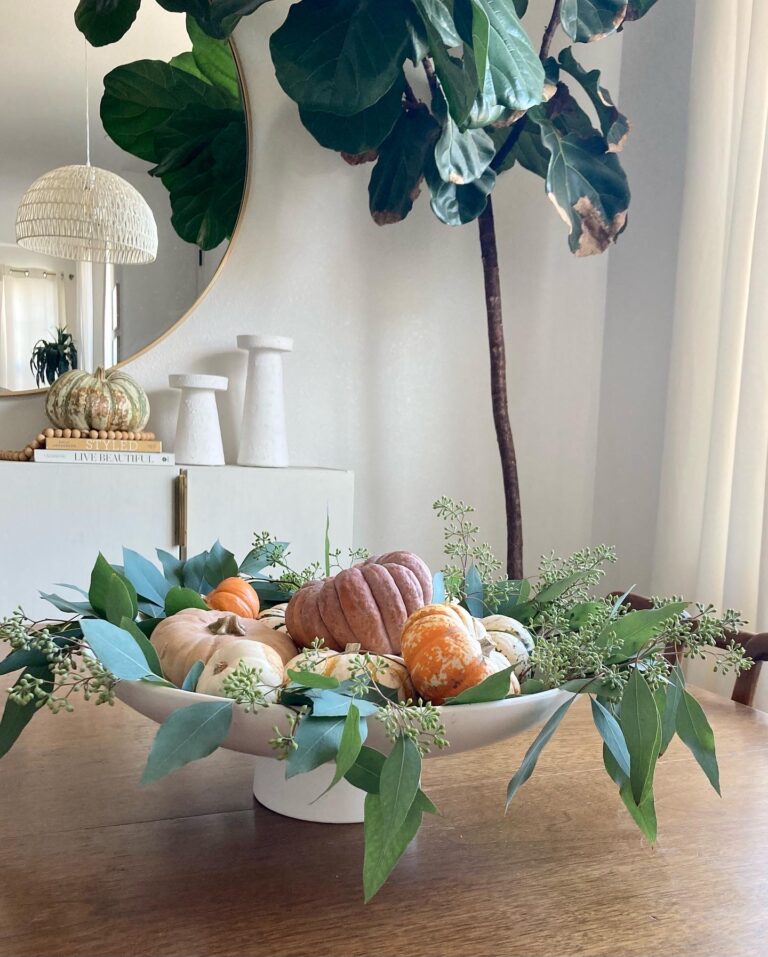
So first I wanted to share with you guys an easy centerpiece that I put together with a few pieces that will really dress up your Fall or Thanksgiving table. One is a bowl of pumpkins with eucalyptus that is perfect for a smaller dining table like ours. You can use any ceramic bowl or even a planter that you have available. I placed the eucalyptus on the bottom of the bowl first and then stacked the pumpkins so that you could see all of the colors and it has been one of my favorite most festive centerpieces to date. All of the foliage and pumpkins were from my local trader joes. The end result looked like this.
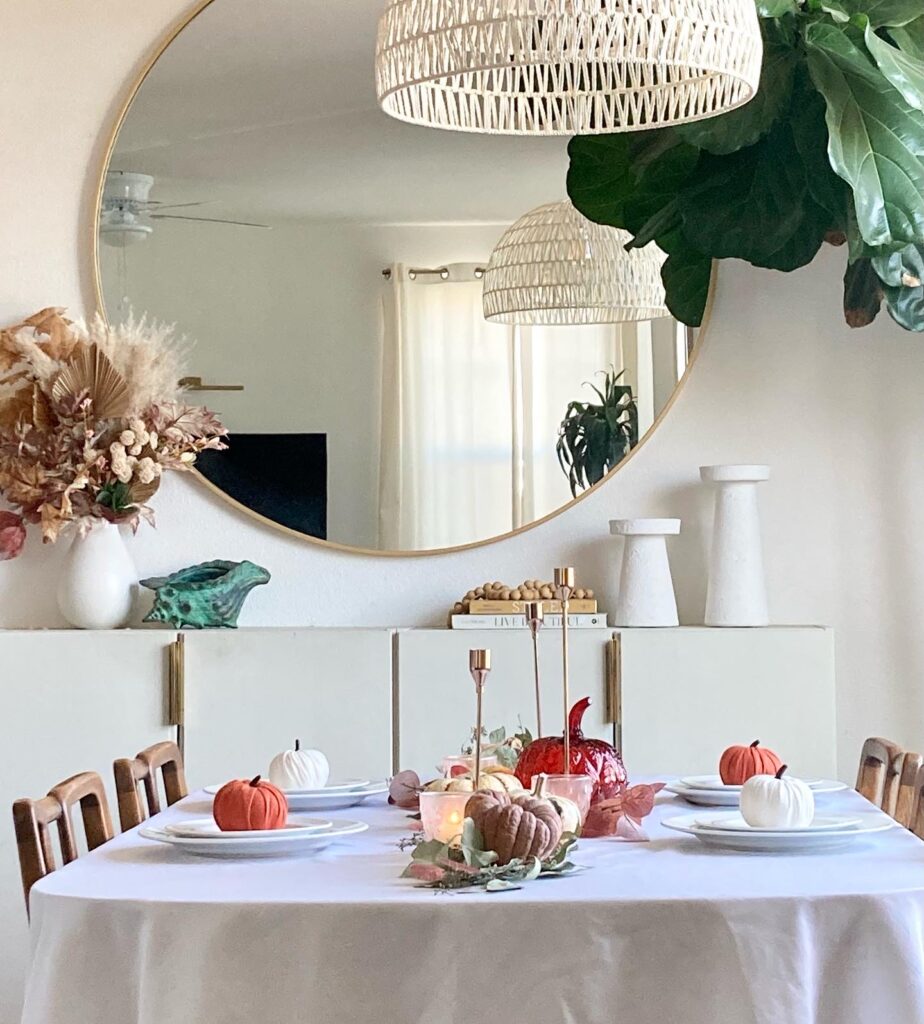
Another of my favorite tablescapes was this deconstructed bowl of pumpkins. I started with a white tablecloth and then trailed the eucalyptus all along in a row. I then placed the pumpkins in a row on top of the eucalyptus and wove in some votives and brass candlesticks. I loved the end result and this ended up being our Thanksgiving table. The best part is that I was able to reuse my florals for the table and everything was natural. I so enjoyed putting it together and capturing the end result. Once the pieces were in place the table looked beautiful.
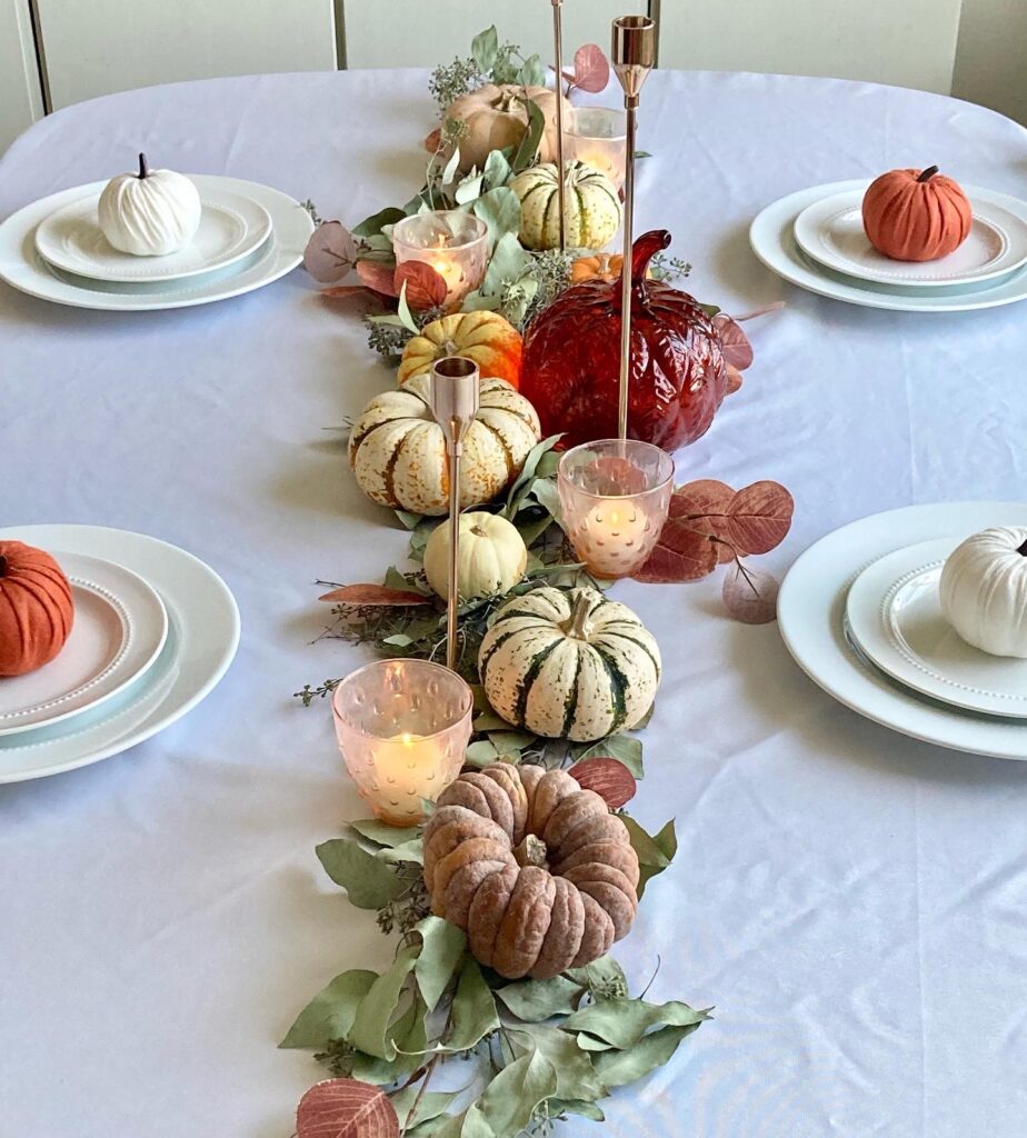
Agian all of the floral and pumpkins are natural. You can find them at your local grocery store, or in my case, I love Trader Joes for this. You can find candlesticks like this here you can also find votives like this here. The white dishes are an old collection from Target, but you can find ones like these here. Felt pumpkins are also from target and they are sold out, but you can find similar ones here.
Tablecloth is also from amazon and you can find it linked here. The centerpiece bowl is from Crate and Barrel and you can find that linked here.
Overall for this coming Thanksgiving Holiday, I hope for us all that we can slow down, savor the moments, reflect on what we truly have to be grateful for and create beautiful moments around our homes. I look forward to baking cookies with my kids, having pie for breakfast , and watching movie marathons all day. I do also love a good slice of turkey, but as of late i’m all about the sides. So I say all of this to say, despite the Christmas rush going on and things selling out already, I hope that you are still enjoying the days of fall and savoring these sweet moments and most of all thinking about all that we have to be grateful for.
Thanks for being here and taking the time to read my thoughts floating out there in this little corner of the internet. I am so grateful for you!
Happy Holidays and Happy Fall days!
Grace
Hey Hey all my Design People,
We’re gonna talk a little bit about how to capture that California Interior Aesthetic today.
Did you know that I specialize in California Style interiors? I used to be very drawn to Shabby chic and Cottage styles back in the day, but I was always really inspired by Mid Century Furniture and Organic finishes. Over time my design aesthetic has developed into what I would say is a Modern Bohemian with a light and airy feel. What a lot of designers and people call a ” California Aesthetic” usually has these key features, as well and Coastal touches because well, Its California we love our beaches after all.
So lets talk first about what a “California Style Interior” is. I would say that one key feature is white or off white interior walls. I think that this is to reflect not only a bright and airy space, but to also kind of mimic the white plaster that you see on the Traditional Mission Style homes here that are Historic to California. Like this beautiful home by Beckiowens.com. Here we see a historic spanish style home.
Another key finish in a California Aesthetic would be mid tone rustic wood flooring. I feel the more natural looking the better. A white Oak, or mid toned oak is very on point with this style. For tile finishes id say again, organic and classic with a Spanish influence is usually what you’d see. Think zellige tile backsplash and terracotta floor tiles. A great modern take on the terracotta trend are terracotta tiles in black or neutral colors and not just the red clay alone anymore. Although I must say that I am also a big fan of the classic red clay terracotta as well. How about metals? Hmm well in sticking with that warm and organic style, the metal finishes would be either matte black, or antiqued brass. Think vintage finishes with modern lines. Here is a beautiful example of some of those classic finished by the queen of California style herself Amber Lewis from Amber interiors.
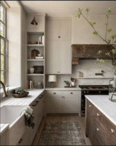
Now that we’ve covered the finishes, lets talk furniture and decor.
Natural textures and pieces that have a lot of organic movement are what were looking for. Think of the timeless appeal of a linen sofa, or the beautiful texture of a caned chair. The more texture the fabric has, the better. I love the luxe addition of a dark or natural toned velvet as well. These fabrics and textures will stand the test of time and age so beautifully.
Stone and wood are other great additions to a California style. A stone or marble coffee table is a beautiful addition to any space, or how about a deep rich wood side table. The natural materials of these pieces make them not only appealing, but classic and a great staple in your design. Whenever I think of decor for these spaces, the same applies. Natural materials and textures will always go well together. Just like a beautiful piece of landscape art will never be off trend. Heres a beautiful example of great textures and materials by Lulu and Georgia via luluandgeorgia.com
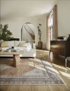
So if you’re trying to nail the California style, get out there, play around with patterns and textures, see what you really like. Do you like a terracotta vase, or are you more drawn to a wooden bowl, or both. Mix and match colors and textures and build a style that you will really love.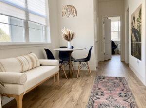
Always sending love and style,
Grace.
Hey Hey Hey My Design people,
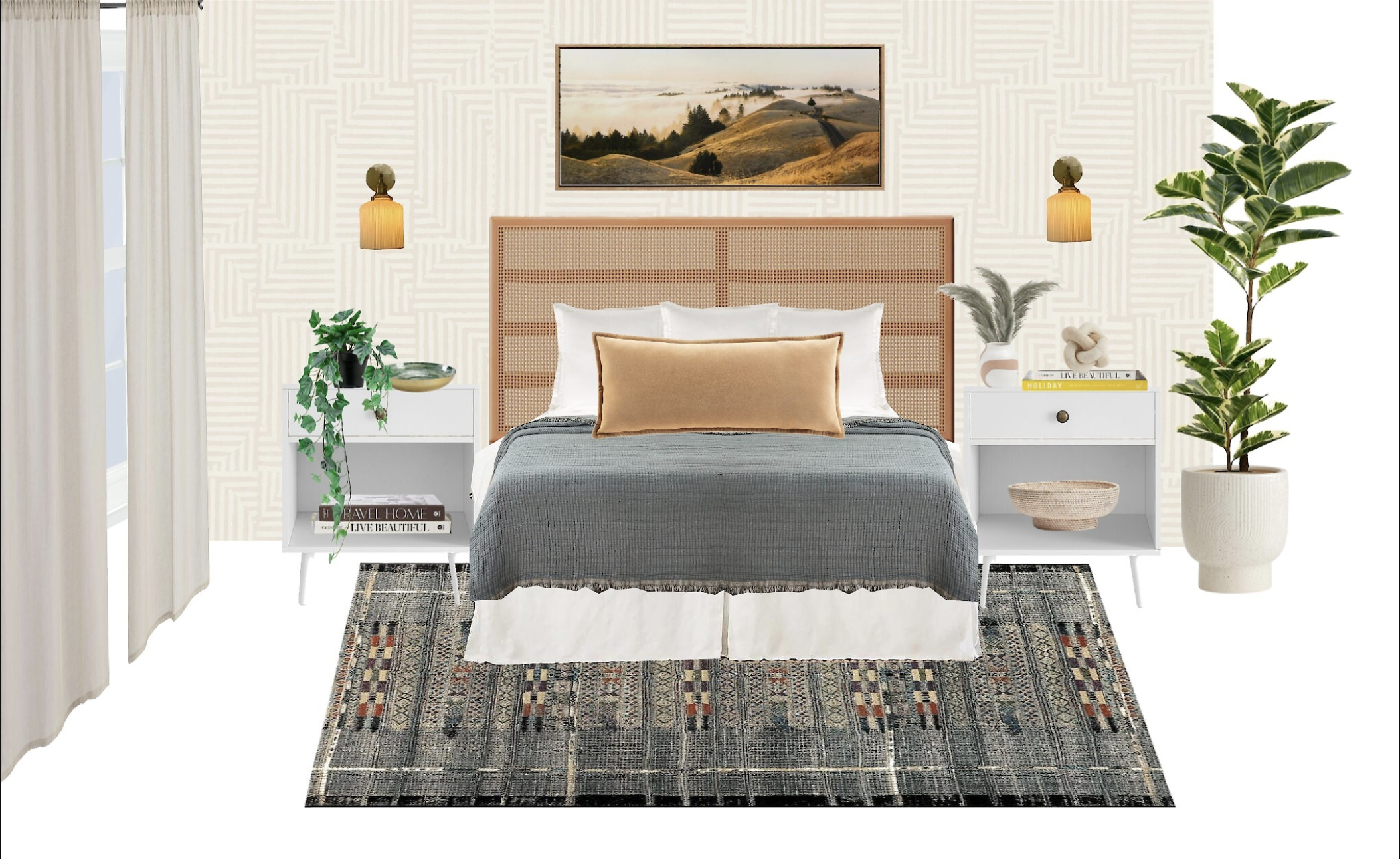
Today were working on a build a better bedroom blog. See if you can say that 5x fast. But seriously, back to the business at hand. I want to talk to you today about how to build a better bedroom. There are a lot of homes that I have been in where the owners have great main spaces and once we get done designing those, we move along and find that their bedrooms are often a mix of college pieces and a mish mosh of stuff. I think generally we think about the spaces that people are going to see the most and our bedrooms often get left on the back burner. Well today I am going to show you how to pull togehter a bedroom quickly and on budget.
Creating a great design is like following a good recipe. There are key design elements that you want to have in a Bedroom to pull it all together and to make it an elevated space that you will love to spend time in. Let me break down the formula for you that will provide balance, scale, and a bedroom that looks designer as opposed to a box store matched set (which its cool if you have that, we’ll teach you how to spruce that up too). We want something thats more interesting like you and I am going to give you advice on just how to do that.
1. BED
Lets start with the most important piece in the bedroom which is obviously the bed. Now if you have a little bit more of a budget and can afford a whole bed I would recommend that. They are a sturdier structure all together and theres less guess work on how to style it for your space. I am a fan of a wood structure because they are timeless and can always be painted if you want to change up the color. The bed I am in love with right now is this bed from CB2 that comes in at $1299.00 for a queen.
Now if you’re on more of a budget, then lets talk about a great alternative. You can opt for a headboard and finish off your bed with a boxspring and frame. This will come in a bit more economical and still looks great. My favorite headboard for the price point right now is this queen sized headboard from tartget (at just $170) in a similar style as the CB2 Bed. I usually like to pair a headboard with a tailored bedskirt for a more sleek look. This is a favorite bedskirt.
2. Nightstands.
Lets talk about nightstands. So as a rule for myself and for my clients, I strongly suggest not matching the nightstands to the bed. So if the bed comes as an option to add the nightstands as a set, I recommend opting for different night stands. The reason is it gives a higher end designer look. Now if you have a matching set, no worries. I would suggest just painting the nightstands a different color than the bed. Now in this case, the bed is wood and rattan, so what first comes to mind for me are white nightstands for a lighter brighter space, or black nightstands for a space that has a little more of a modern or masculine edge. These black nighstands are a favorite and I love them in green as well. You can find them at West Elm.
There’s also this white version that is similar to the style in the design above and you can find them for a great price at Wayfair.
3. Lighting
Lighting is such an important feature in rooms and I think that a lot of times this gets pushed to the back burner, or we somehow end up with those hideous tower lamps as an option and never change them out. Well, I am here to tell you that you have a lot of options and we can add lighting that has a lot of style and comes in at a very reasonable price point. So one of my favorite picks instead of bedside lamps, are sconces. These come in a variety of styles and mounting options. The sconces also free up some much needed bedside space. Here there are some hardwired options that you would need an electrition to install, then there are plug in options that need no work whatsoever. Here are some of my favorites.
I love these vintage modern styled sconces that are an amazing price on Amazon. These are the hardwired option.
The next option are plug in sconces and I love the mid century modern style of these. You can find these at World Market.
4. Rugs
Rugs by far for me are one of the elements in any room that can take it from a little drab to beautiful! They really add that extra layer to the room that adds color and texutre, but also grounds the furniture and really gives a room a “designer” look. In a bedroom I would say that the rug should at the least come to the halfway point of your bed, and if you can go bigger, then do it.
Some of my favorite rugs are kilim and vintage style rugs. These never go out of style and always feel chic in a space. The rug in this design is a beauty in a kilim or persian style and you can find it here. I also chose this second rug as a more vintage style option which can really change the style of the space. You can find a secondary rug option here.
5. Curtains.
Curtains or shades really amp up the style in a space and add another soft layer to the room. I especially love them in a bedroom because an extra layer of soft texture in a bedroom is so cozy and relaxing. The exact vibes that you want in a room you sleep in. I love the cream colored curtains in this design and how they have so much texture. You can find the neutral curtains here.
If you like the idea of opting for curtains with a design. I would suggest opting for something with a soft pattern and a timeless style. I love these guys from West Elm as a great patterned curtain option.
6. Accent wall
Whether you are going to opt for a paneled accent wall, or wallpaper for your headboard wall, I think that this really takes your bedroom from average to exceptional. I love a great peel and stick wallpaper for a bedroom because it gives the option to change things up easily. Its also renter friendly. If you want to step it up with texture in your space, then prefabbed wall paneling is a great shortcut and only requires a few nails to hold in place.
The wallpaper in this design is modern and neutral and a favorite of mine. You can find this peel and stick wallpaper here. If you prefer the paneling option, you can find a quick shortcut with these paneled pieces here.
7. Art
Listen up and write this down. Art is one of the single most designer touches that you can put in any room . It will elevate any space and as long as you love it, I promise it will look good in your home. I love a good landscape piece of artwork for a bedroom because it again affords another calming element in your room.
I love the art in this design and I have linked it here. I also love this more modern brush stroke art that you can find here.
8. Bedding
Texture, layer, texture. This is the key to a luxurious bed. My suggestion is at least three layers on a bed (outside of the sheets of course). A quilt, a duvet and a throw/coverlet. I think that the layering on the bed really levels up your bedroom and the designer look to your space. I love love love the Casa Luna bedding at Target and I recommend these pieces. I am a big fan of this quilt. I love their Duvets and I have this one for my bed. You can find it here, and this coverlet is amazing.
9. Pillows
This is where you really get to have fun with your bed styling. So the formula for a primary bedroom bed is sleeping pillows, euro pillows, 2decorative pillows for queen, or 3 for king and a long lumbar to finish it off. I love the natural textures of linen and cotton on a bed. I am a fan of these euros. The texture is lovely.
I also really like HM home for Accent pillows. I love this set for bedding. You can shop these Hm Home accent pillows here. The last fail proof piece to your bedding design is an extra long lumbar. I love the one in this bedroom design and you can shop it here.
10. Plants
Last but not least whether you are a fan of real plants, or fake, theres no denying what some greenery does for a space. It will really brightens up your room and adds life to your design. I love a good tree and some bedside plants. You can shop trees here, and you can find cute bedside plants here.
Remember, you don’t have to add everything at once, but like I always say you should definitely have a design plan before you start purchasing. Its okay to work a little at a time and its important to work within your budget. The only thing that I would recommend purchasing all at the same time is your bedding. This way your bedding will be cohesive and nothing will sell out before you get the chance to finish your set 😉
So there you go. A good design is like a recipe. Follow the steps and you’ll never go wrong. As always I hope that you found this info useful and if you ever have any questions feel free to send them my way.
Peace, Love and Design,
Grace D.
Hey Hey Hey my design People,
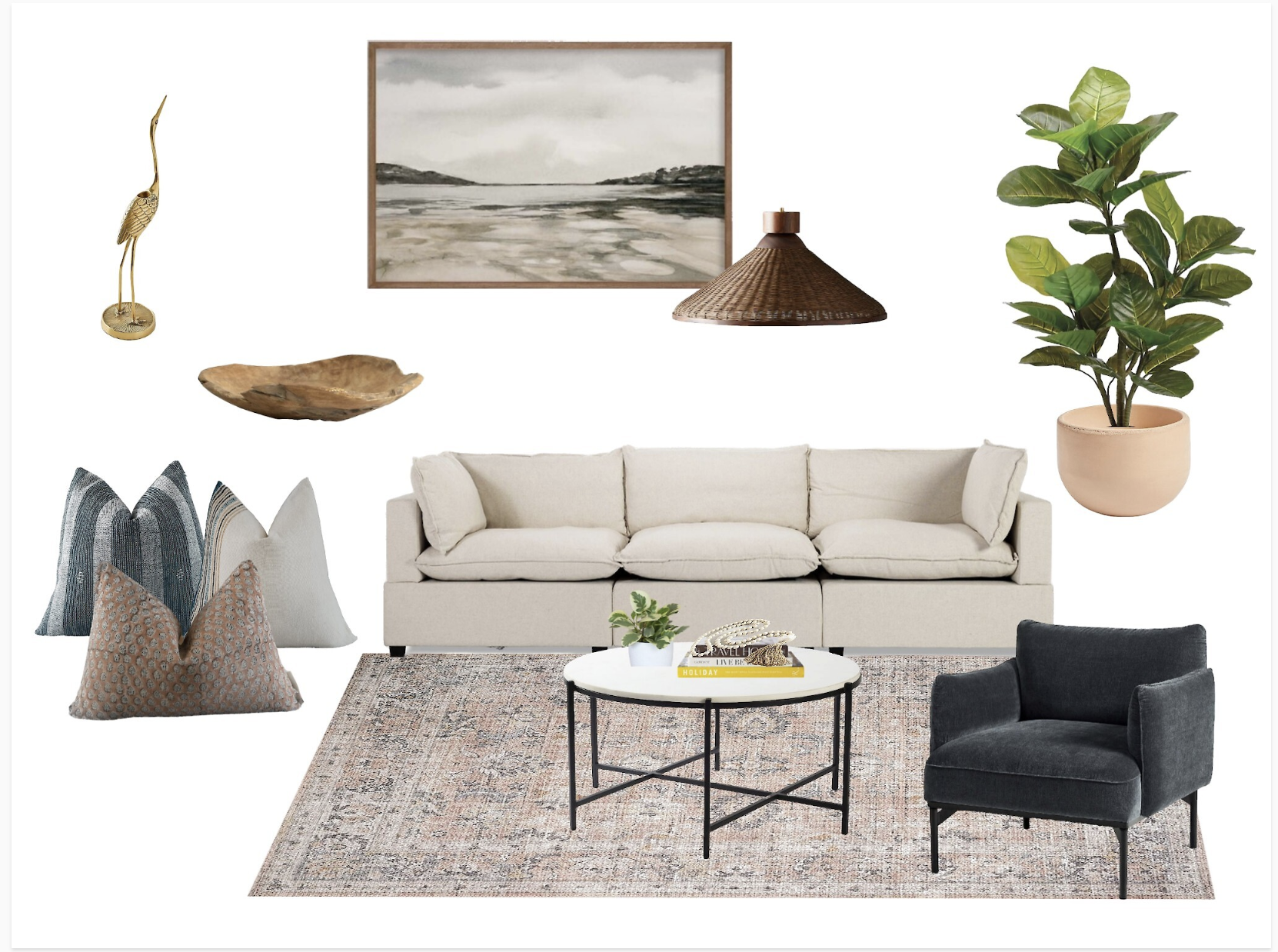
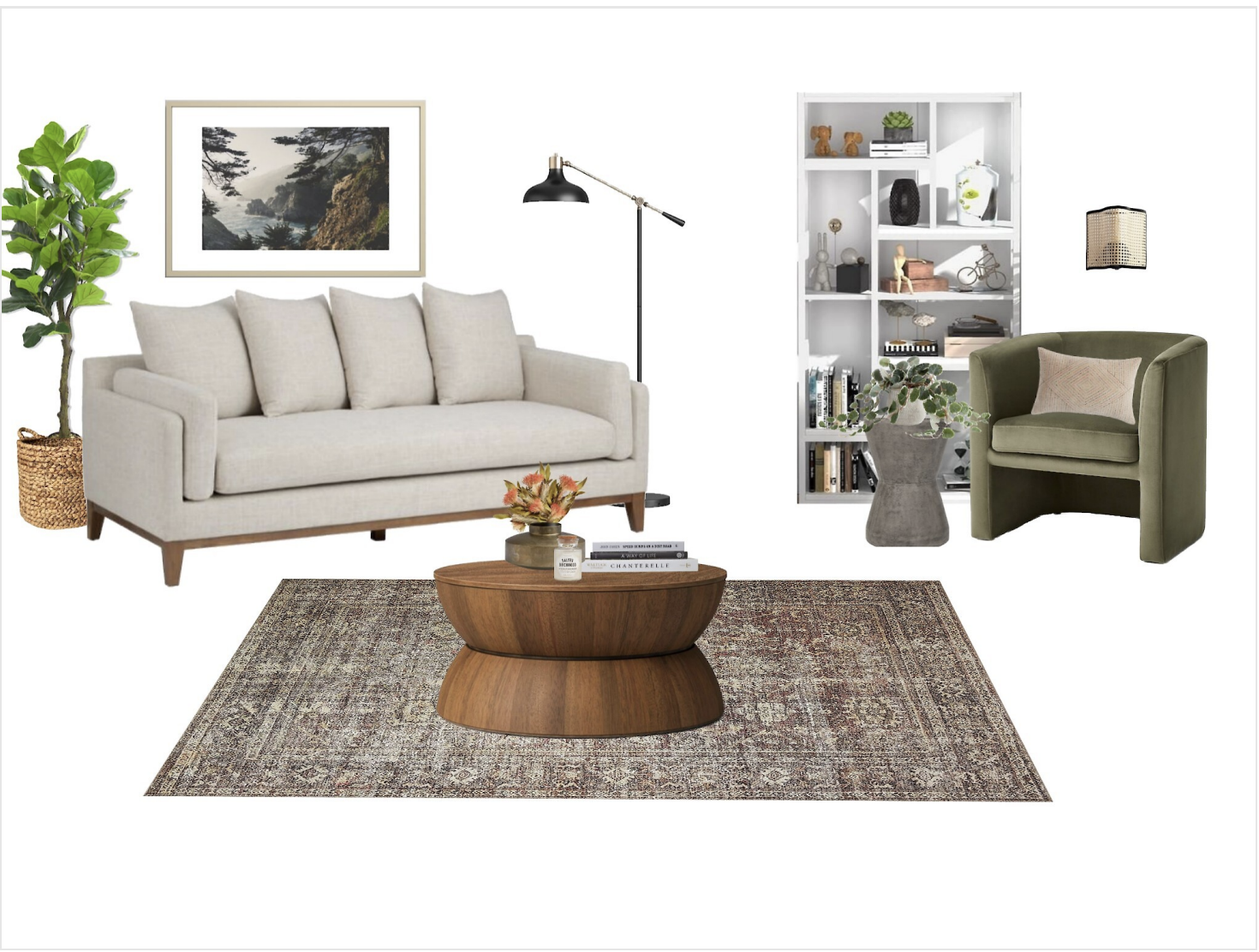
Today I have a post for you on how to get a designer look without a designer price tag. I have pulled together a design for you above with my top picks for pieces that rival higher end brands and price tags at much friendlier affordability. So this living room design that I have created above includes some great timeless pieces that I would recommend for anyone that is building a design on a budget. This look reflects a modern collected style that includes pieces that are not only versatile, but can easily be updated with changing trends and design styles.
So lets get into it. I’m going to take you back in time a little bit and tell you about how I still have the pieces in my living room that my husband and I purchased 10 yrs ago. We went with streamlined mid century styled furniture that tends to be timeless and can be outfitted with many different styles. Now If I were starting today and building a design for myself, or working with someone that is, these are the pieces that I would totally recommend. This design reflects a modern California Collected style that I think blends modern design pieces with organic textures and colors. It also offers a few design tips that I have have learned over the years that look super high end, but are actually very affordable. This entire design above comes in at a total of $2303.12. That’s literally just part of the cost of one piece of designer furniture.
First let talk about this sofa. I love the oatmeal color and the acorn wood colored legs. The wood trim at the bottom of this sofa elevates the look and offers another design element to this piece of furniture. I also love the back cushions that look super comfy and layered. This particular sofa comes in at the highest price in our design and is $799.00 there is also an extra 10% off if you pick it up in person. Woohoo! It is from Worldmarket. You can shop the Lukas Ivory Deep Seat Sofa here.
The Second piece that I am very impressed with is this Vernon Upholstered Barrel Accent Chair. It comes in 4 colors and Is from Target guys! Seriously this looks like a CB2 piece and is very affordable, coming in at $300.00. This chair is a favorite among many instagramers and I can see why. I am kinda mad that we don’t need anymore chairs in our home, because if we did. This would definitely be a must buy. A little designer side note for this piece is that the velvet finish and Olive green color really elevate the design and make it a great piece for any home.
Next lets talk about this coffee table. I love the drum shape and again this natural wood finish is very elevated for the piece. The streamlined style of this furniture makes it very versatile as well. I love pairing very linear pieces against a rounded shape or edge and I think that a round coffee table is a great juxtaposition against the backdrop of a rectangle sofa. This table comes in at $180.00. It is a Target piece, and the Prisma Round Natural Wood coffee table is available online.
Another furniture piece that I think will look great in a living room design as well as in an office etc. is this bookcase. This particular white bookcase is from overstock.com and I love how a profile bookcase kind of gives you direction on where to place things. This is another score coming in at 179.99. You can shop the bookcase here.
Onto some of the smaller accent pieces in this design now!
I was very impressed with this concrete end table from Walmart. The hourglass shape is so designer and I love how the shape adds more interest to this furniture piece. This is the Safavieh Torre Concrete side table and you can shop it online.
The floor lamp in this design is one of my favorite go to’s for living rooms and office spaces. I love it in the black and brass. This is another winner from Target and comes in at a great price point as well at just $70.00. You can shop the Crosby Schoolhouse floor lamp here.
This rug is amazing and I am so impressed with the price point. It is the Amber interiors x Loloi collaboration. You can shop this Beauty on Amazon for just 170.00 for a 8’4 x 11’6 rug! The antiqued design on this rug particularly makes it look very high end and classic. You can shop the Amber Lewis design here.
For extra ilfe and greenery in your space I always love a good indoor tree. If you’re a little too intimidated by a live tree in your home, try this beautiful artificial fiddle leaf fig tree from Amazon for only 81.99 for a 6ft tree. That is the best price I have found a 6fter in . You can shop this tree online
Designer tip #10001 (Just kiddin) that I have for you guys is to add a basket to the base of your trees and indoor plants instead of a clay planter when you’re on a budget. The basket looks beautiful and organic with the plant and you will save a pretty penny. This basket comes in at $26, whereas clay plant pots can often run upwards of hundreds.
Amazing find #10 This wall sconce is so beautiful and I was also very surprised to find on Amazon. A great way to fill in wall space across from art and mirrors is adding a beautiful lighting fixture. This modern wall sconce is just $64.73 and you can shop it here.
Last but not least a good design needs a good art piece. I love this photo and all of the soft colors in this beautiful landscape. This beautiful piece comes in at $138.40 and that is including the frame! You can shop this Big Sur Art piece on Society6.com.
I hope that you find some good pieces from this post and that you love. I am also wanting to pass on some good design advice to you all and feel free to let me know if you have any questions or want a specific post on something. I’m always listening!
Sending Love and good design!
Grace D
Hey Hey Everyone,
Today I want to talk to you about how to build a design. Do you ever look at design magazines and your Pinterest pages and wonder how people create such cohesive designs and spaces? Do you wonder how designers work to create a cohesive design and not get lost in the myriad of choices out there? Well you’re in luck! Today I am going to give you a few tips that will help you to start building and creating designs like a pro. Let’s take a little dive into the design process and how to avoid decision paralysis. So lets jump in party people.
1. First I would say take inventory of what you already have and what you are going to keep for sure. I know I’ve mentioned this in previous blog posts, but it is so important. If you are going to be keeping large pieces and or meaningful furniture that you are not going to part with, this is your starting point. Its as easy as this, your design starts with the pieces you already own. Everything you choose from here is going to be built around the pieces you are keeping. This way you will end up with a cohesive design and not a mish mosh of random stuff.
This is pretty much the number one problem that I see with people trying to tackle their own designs. They just go out and start purchasing things that they like with no regard for what they already have and it makes for a disjointed design. If you are starting from scratch thats great, you can build your design without having to worry about working around existing pieces. This is an easier place to start, but about 50-70% of us are starting with pieces we need to work with, so if you’re starting from scratch congrats you’re one of the smaller percentage of us that needs to make less decisions.
2. Get your inspiration! Whether its from Pinterest, Google search, or Houzz, start collecting images of places and spaces that you love. Look for the common thread in these photos and start to pick out what you really love and think of how that will fit into your space. Once you have a direction of the style that you like, start to build a design board. DO NOT LET THIS STEP OVERWHELM YOU! Building a design board is not as hard or intimidating as some might think. I would start with a Mood Board App, or with Canva to start pulling images of things that you love and see how well they work together.
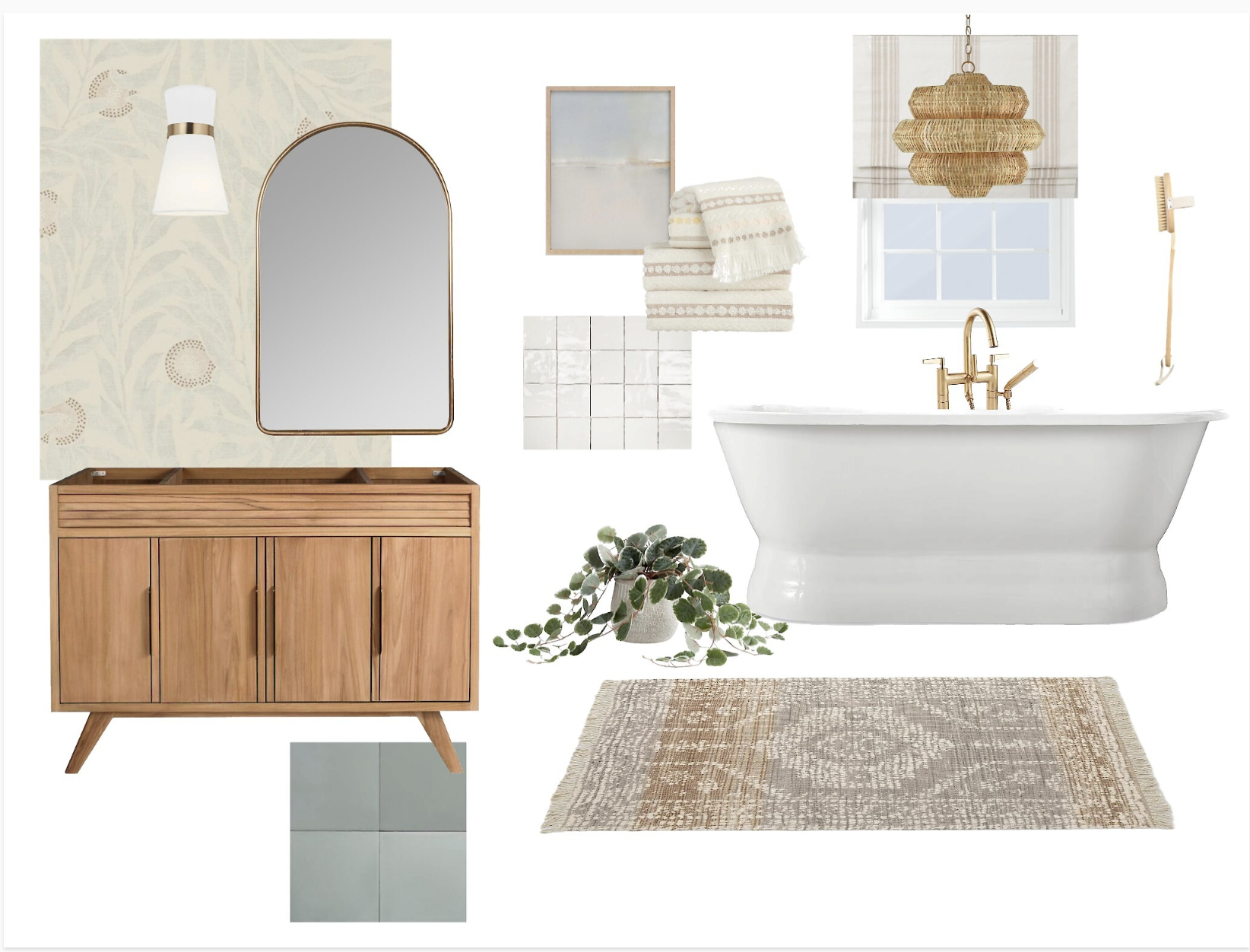
3. Build your board. Building a mood board will be like anything else It will take a little bit of practice, but after you do it a couple of times you will get the hang of it. Lets brake down the must haves on your design board. Lets say you’re working on a bathroom. Heres what your must haves will look like.
1. a paint color or finish such as wall tile.
2. Floor tile
3. Lighting fixtures
4. Bathroom Vanity
5. Tub/ Shower or both
6. Rug, art, wallpaper
7, Plant and accessory
4. Avoid Design Paralysis! So now lets discuss the decision paralysis that envelopes so many design options. There are two things that you can do here.
1 if you feel completely overwhelmed and don’t want to spend your mental energy here, bring in a designer to help you refine your design. Often times if you are booking just a consult, or a Just a design without installation or oversight by a designer and you are overseeing the installation and or DIYing the install yourself, designer fees are usually very reasonable.
Now the other option is that you are doing this all yourself, so how do you narrow your decisions down? Well at this point you go back to the basics. Go over your inspiration photos, stick close to these, go back to your moodboard, and stick close to this. There are millions of ways that a design will look great in a space, and no one design is right or wrong, there is just balanced and unbalanced design. Also look at the architecture of your home. The style of your home and the starting point of your base will help you narrow down your decisions. For example if you are working with black floor tiles that you know you will not be replacing, then you will want to pick things that will compliment that.
All in all if you start playing around with building mood boards and really seek out your inspiration, you’ll have fun finding your footing and direction, and just remember there is no right or wrong design, go with what you love and you’ll never go wrong.
Heres the shopping links to the pieces on the mood board above.
Bathroom Vanity (similar one here)
Peace, love and design!
Grace D.
Hey Hey Hey! Hi Everyone!
So the sun is shining and the warm weather is around the corner, and if you’re anything like me then your inbox is full of about 999 million emails about new outdoor collections. Also if you’re like me, you’ve taken a look around your backyard and your realize that it can really use a little update, if not a facelift, if not a whole new replanting plan. Maybe you’re better than me at keeping up your plants, but we did try to be responsible and planted a whole bunch of drought resistant plants, that have recently gotten a lovely downpour and in turn have gotten a little flooded and maybe a little root rot.
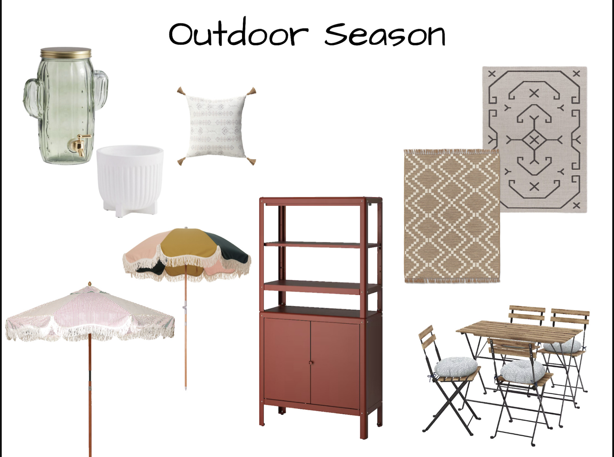
But I digress, the point is that even though I cannot help you with your replanting and landscaping plan, I can definitely help with your outdoor design. In this blog post I have a few of my favorite pieces that I have sourced for some outdoor entertaining and some outdoor living and dining and just all around loving life. So without further ado! Heres some of the favorite pieces that caught my eye.
1. 
How cute is this drink dispenser by World Market. I can totally see this holding your drinks for your outdoor Taco Night. you can shop this cute cactus drink dispenser here .
2. 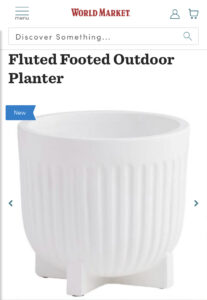
Heres another great find from World Market. Such a beautiful outdoor planter for your patio space. You can shop this modern planter at this link.
3. 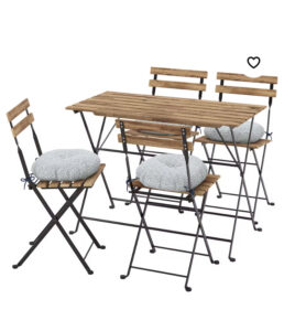
Lets talk seating for a smaller outdoor space, or a cute corner in your backyard. I love this Ikea set. This table and chairs all fold up to be stored when your not using them, or when the season is over, but are a great little dining set for your outdoor space. You can shop these at the link here.
4.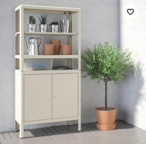
How nice is it to have this storage for your outdoor space. I love that this can store gardening tools, outdoor toys, outdoor tools etc, but I can also see this doubling as a drink station for your outdoor party. Picture placing tons of plates on that bottom shelf and using the top shelves for drink dispensers and cups. I can see it now. Lets party. You can find this cool piece at Ikea link here.
5. 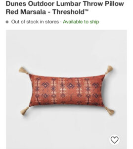
I don’t exactly remember what year it was that Target started nailing home decor, but I think its safe to say that every season Target rolls out with some great finds and some great designer partnerships. I am loving this modern boho outdoor pillow from target. Its the perfect addition of color for your patio furniture. You can shop this little cutie pie here.
6.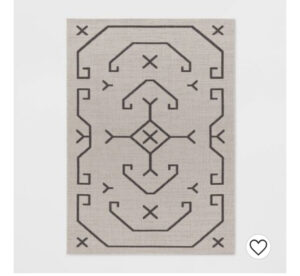
Heres another great find. This outdoor rug is a 5×7 for just $60. This is such a cool modern design and if you have black accents in your outdoor furniture I think this is a no brainer. Run don’t walk to pick up this guy.
7. 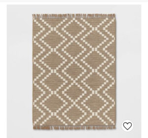
If you’re looking for a versatile outdoor rug style, this is the one. You need to look no further than this little gem from Target. Also coming in at $60 for a 5×7. Such a great price in a time that a lot of things are a little higher priced. You can shop this look here.
8.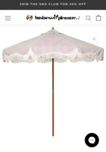
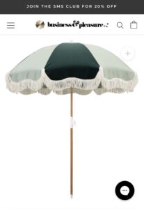
So I have to say first, that I have a huge love for Business and Pleasure co. They have that Old Hollywood/ cool Palm Springs style going and I cannot get enough. Imagine how much style one of these (or both of these) umbrellas would add to your outdoor space. I am looking forward to adding one of these to my backyard. You can find these styles plus more at www.businessandpleasureco.com . Shop the pink striped umbrella here, you can also shop the green umbrella here.
I hope that you have fun refreshing your outdoor space, and I will keep you posted on how the replanting and design facelift for our backyard is going. Wish me luck and happy designing!
Sending Love,
Grace
Hi There guys,
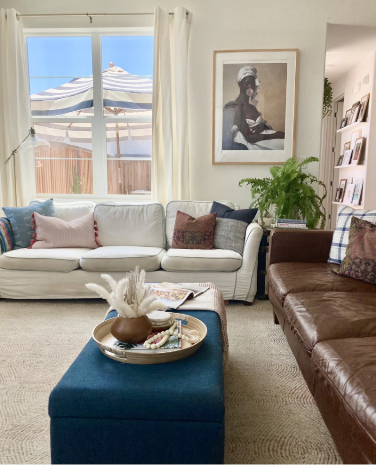
I hope that everyone that is stumbling onto my little blog finds something useful here. I was just thinking the other day when I was working on a new project in the house, that our space has really come a long way in the last few years. We have been in a position in the last few years to really round out our design and add to our existing collection and it got me thinking. I wonder what our style would look like if we were starting from scratch.
Let me digress a little bit and talk about what a collected style means. So when most people think of a collected design style, they think of a space that is so eclectic that it doesn’t make sense and that your eye begs to make sense of something or find cohesiveness somewhere. Well a collected space is actually quite the opposite. When we describe a collected style, all that means is that there are pieces in your home that are purposeful and meaningful and you chose to design around those pieces as opposed to purchasing all new, or just buying as you go without a design plan in mind.
So back to my original thought process, what would our style look like if we were starting from scratch and starting new? Well, my gut tells me that there may be a few pieces in our home that are a little more modern , however I don’t think that our style would be much different. The furniture thats been passed down to us and the pieces that we have acquired together have done more to shape our overall core style in our home than we have. Meaning I would say that neither myself or my husband had a strong single style before we started creating our home. We both had a love of mid century modern design and we both were bringing in vintage pieces that family had given us, so we started there and built on that.
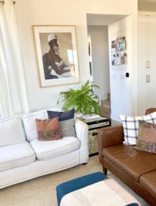
So where does the collected come in? Great question! It looks a little something like this, I have a vintage trunk that my grandmother gave me passed down from her uncle. I love the look of it and the vintage finish it has on it. It is a little traditional, and I thought a great way to balance that piece would be to add some modern streamlined furniture to the space to balance out the traditional feel of this particular furniture piece. So in comes the mid century furniture that pairs so well with the soft corners of this piece. So I guess what I am trying to convey here is that a collected style means a purposeful design based on pieces that mean something to you and that you have collected over time.
When I look around my home, I see new furniture pieces that we purchased to accompany the older things that we have brought with us. I see art that we purchased that brings in a vintage feel with a modern edge that tie the old and new together. I see lots of plants that we both have a love for that add a brightness to the space and I see accessories that i’ve purchased keeping in mind how a round vase would play well off of a very streamlined modern piece of furniture. Overall creating a collected space is about creating a very personal meaningful style and always having a plan when you buy new. Keep in mind how well something is going to accompany the things that you already own. Its personal, its curated and your home should feel like you.
Here are 5 quick things I would recommend when building your room design.
1. Take inventory of what you already have.
It seems intuitive, but many of my clients rarely do it. Look around, what is a must keep, and what is a “that can go” then start looking at what will work well with the pieces that you love.
2. Start with your foundation.
Look around at the style of your home. Do you live in a Spanish Style Home? Do you live in a Mid Century Home? Do you live in a very traditional Victorian style home? The style of your home can give you a great starting point for the design direction that you can go in.
3. Go Neutral on Big pieces and walls, then add color
Emily Henderson said this in her first book and I couldn’t agree more. The more you love color the more neutral your walls and finishes should be. This will allow you to add in a lot of color with your art and accessories without feeling overwhelmed in your design. I would also say that there is an acception to this if you are sure you love a moody dark room, or love a monochromatic space, then go for it and paint that whole room green, blue, etc.
4. When purchasing large furniture pieces think for the long term.
Many of the pieces that we owned have followed us through the last 10 years because we purchased with the future in mind. We have a slipcovered sofa (easy to change out the cover) we purchased mid century modern chairs that never go out of style, and we have a leather sofa that matches everything. So you get the idea. Try to buy versatile large pieces.
5. Don’t be afraid to mix and match.
I think that a great way to add personality to your home is to include some old pieces. If you don’t have heirlooms from family, really take a stroll at your local flea market, or a antique store and pick up pieces that really speak to you. If you love it, you will always find a place for it. Some of my favorite finds at vintage stores are brass pieces like little trinket trays or sculptures, and unique vintage planters. These always add great personality to my spaces and they never go out of style. Not everything you purchase needs to be the new Target collection or Pottery Barn Seasonal catalogue. Get bold and do some vintage shopping.
I hope you have a great time creating your home!
Sending love and Style,
Grace

 .
. 
Hey Guys,
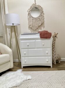
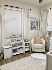
I had the very fun job of designing my nieces nursery a while back . She made her arrival in October and even though we didn’t have everything in place right away, I had helped her Mom and Dad pick out the main pieces. We opted for this amazing crib from West Elm that is sold out now, but you can find a similar one here . My husband and I also gifted this amazing glider from west elm kids also. You can find that here. The last large piece of furniture that we brought in was a changing table from Target (similar one here) and this textural rug from target as well.
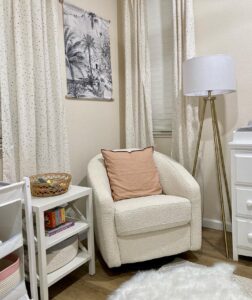
Since this is a rental space, the couple wanted to keep the design simple and not fuss too much with a large peel and stick wallpaper (which I tried to talk them into) so we opted for this wall mural sticker instead which literally takes about 5 min to apply and added so much character to the space. This piece is by one of my favorite wallpaper designers Annet Weelink! I love her wallpaper designs and this piece really shines in this space. You can shop this wall mural sticker here.
So with the big pieces in place I got to come in and finish the styling of the space which is my favorite part. I added these super cute curtains and pillow from HM home and used this Basket from HM Home as a planter for the fiddle leaf fig as well. The cute giraffe stuffed animal and This super cute mobile is also from their kids line too. Curtains here , giraffe here, similar basket here, baby mobile is here and pillow here.
The last piece that I added in this space was the mirror from the Jungalow line at Target that I think added some fun texture and personality to the space and really finished off the design.
Overall we were super happy with the end result and even with the limits of being in a rental and working with a mostly beige space, you can get a lot of design impact by adding curtains, a rug, art and accessories.
My best renter decor hacks especially for kids spaces are, add peel and stick wallpaper, change out light fixtures, add curtains and rugs, and art. These are all things that can be removed and taken with you when you leave and make such a huge impact in the overall design and make the space feel like yours.
Hope you got some great tips and shopping sources here!
Sending love and style!
Grace
